hi, im keera
a visual designer with an
avid love for illustration ♥

Hand Lettered Lyrics

Unmasked Magazine

Royal Records Rebrand

Animated Typography Set

Design Work
Hand Lettered Lyrics

Unmasked Magazine
Royal Records Rebrand
Animated Typography Set


Lets get in touch!
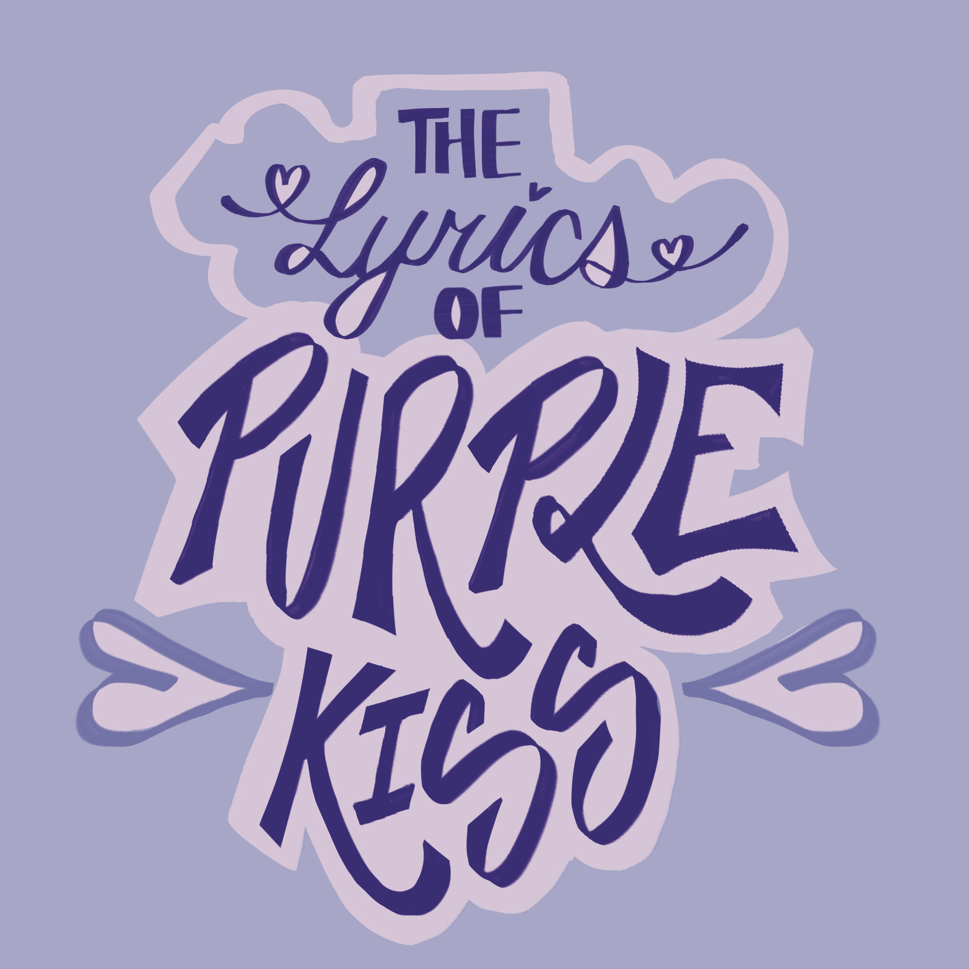
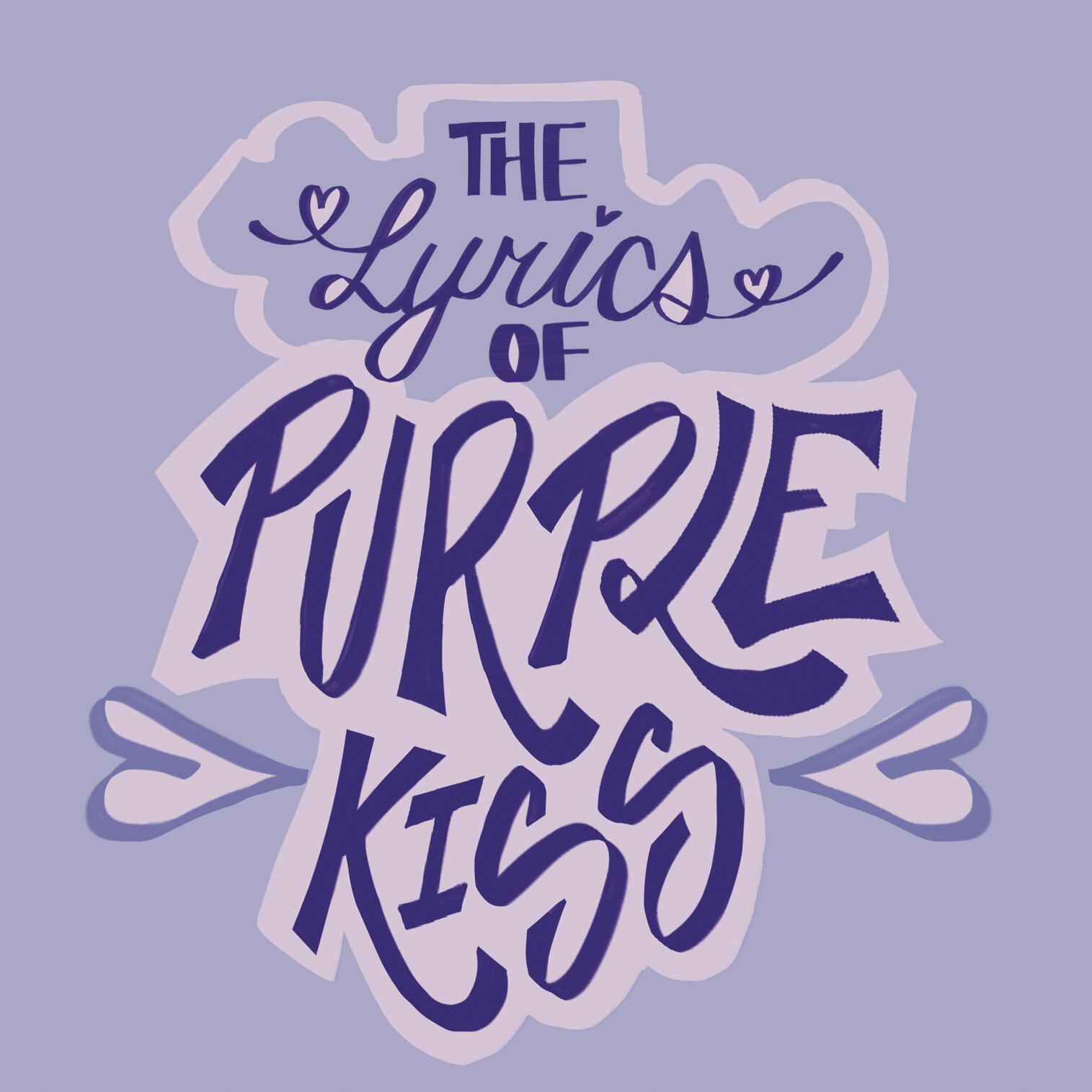
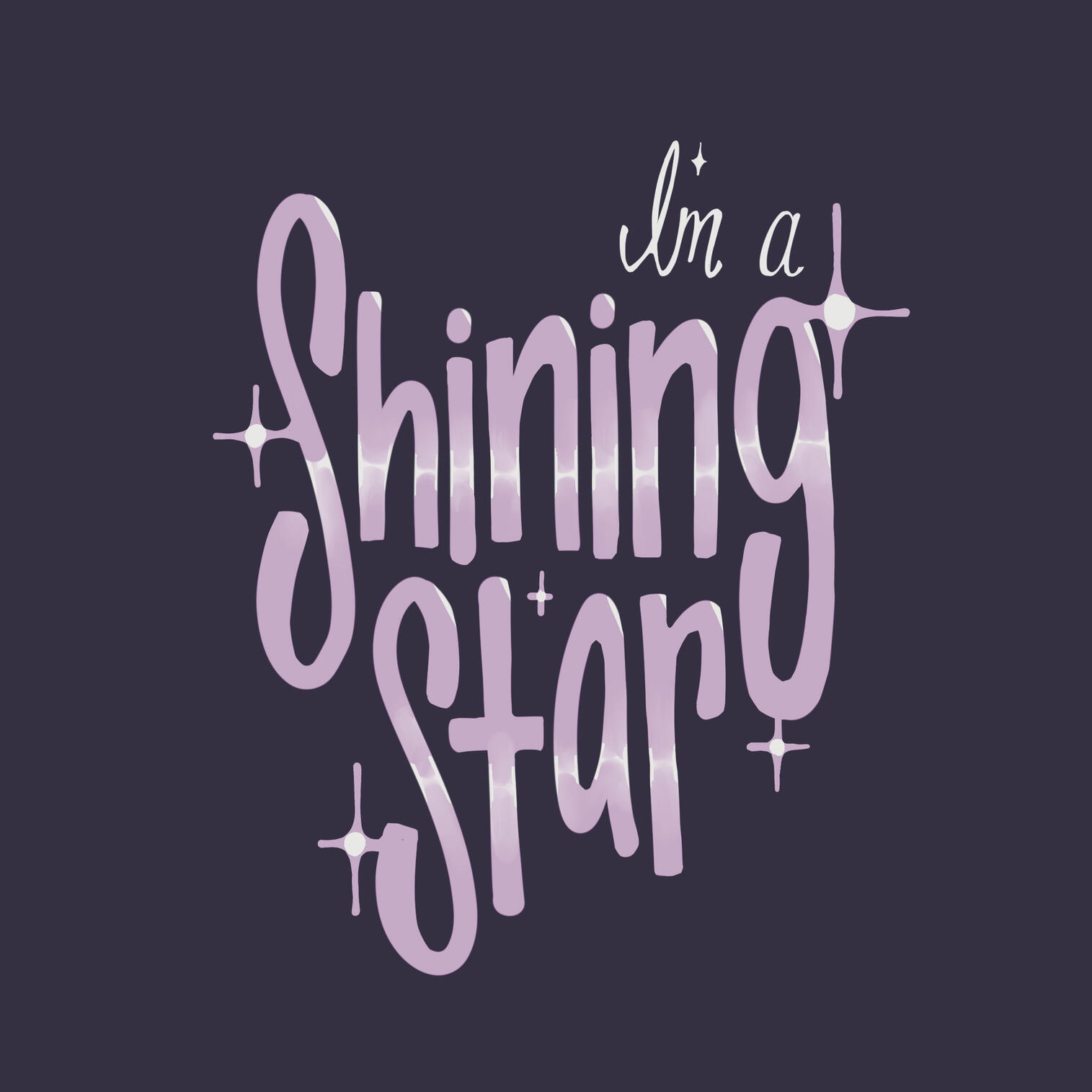
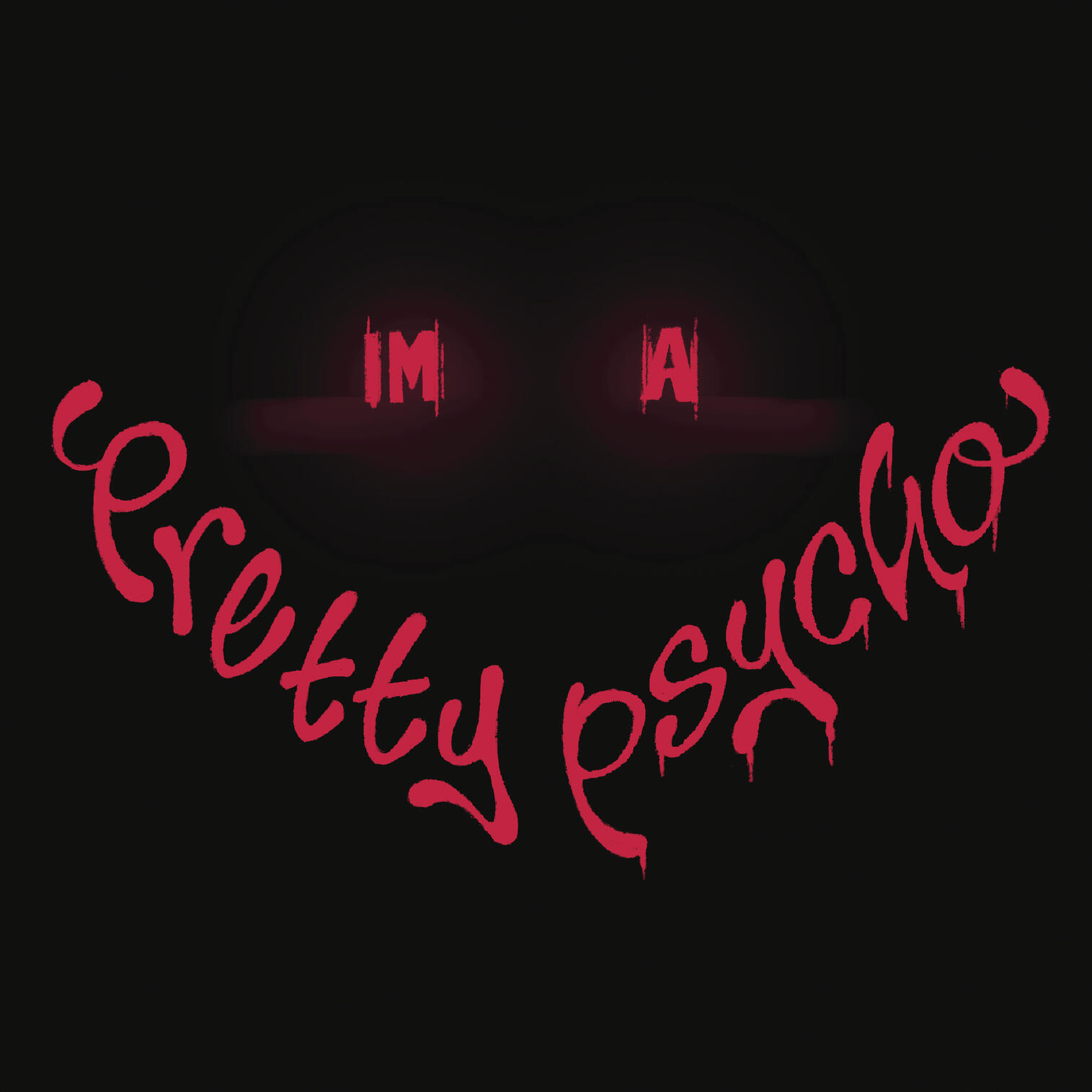
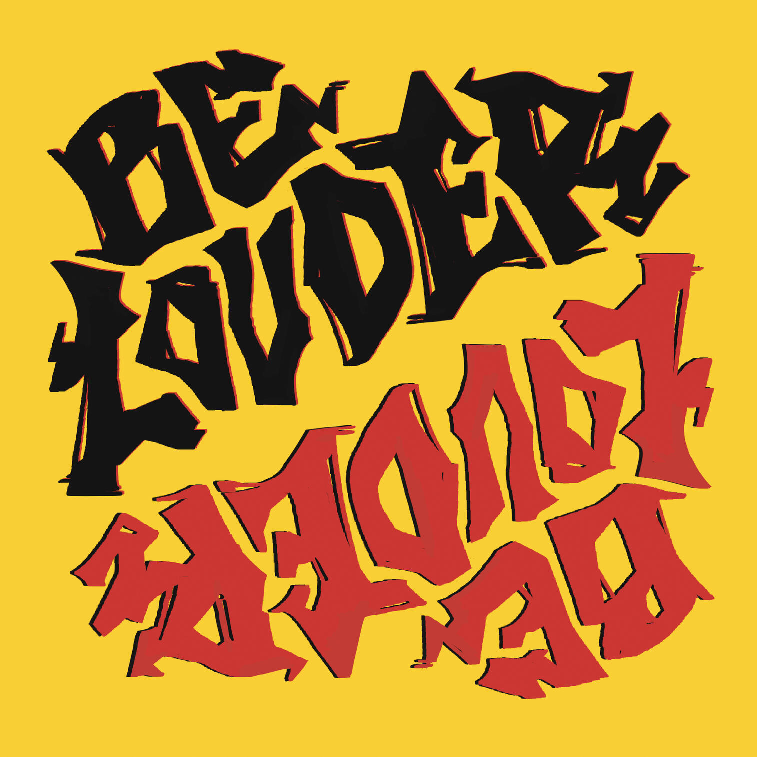
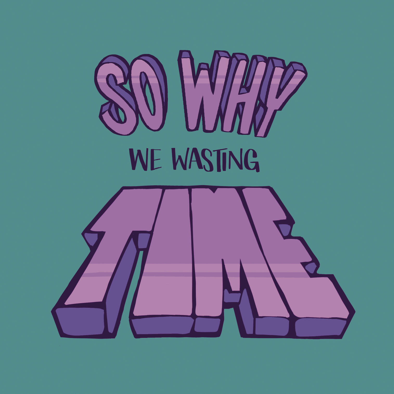
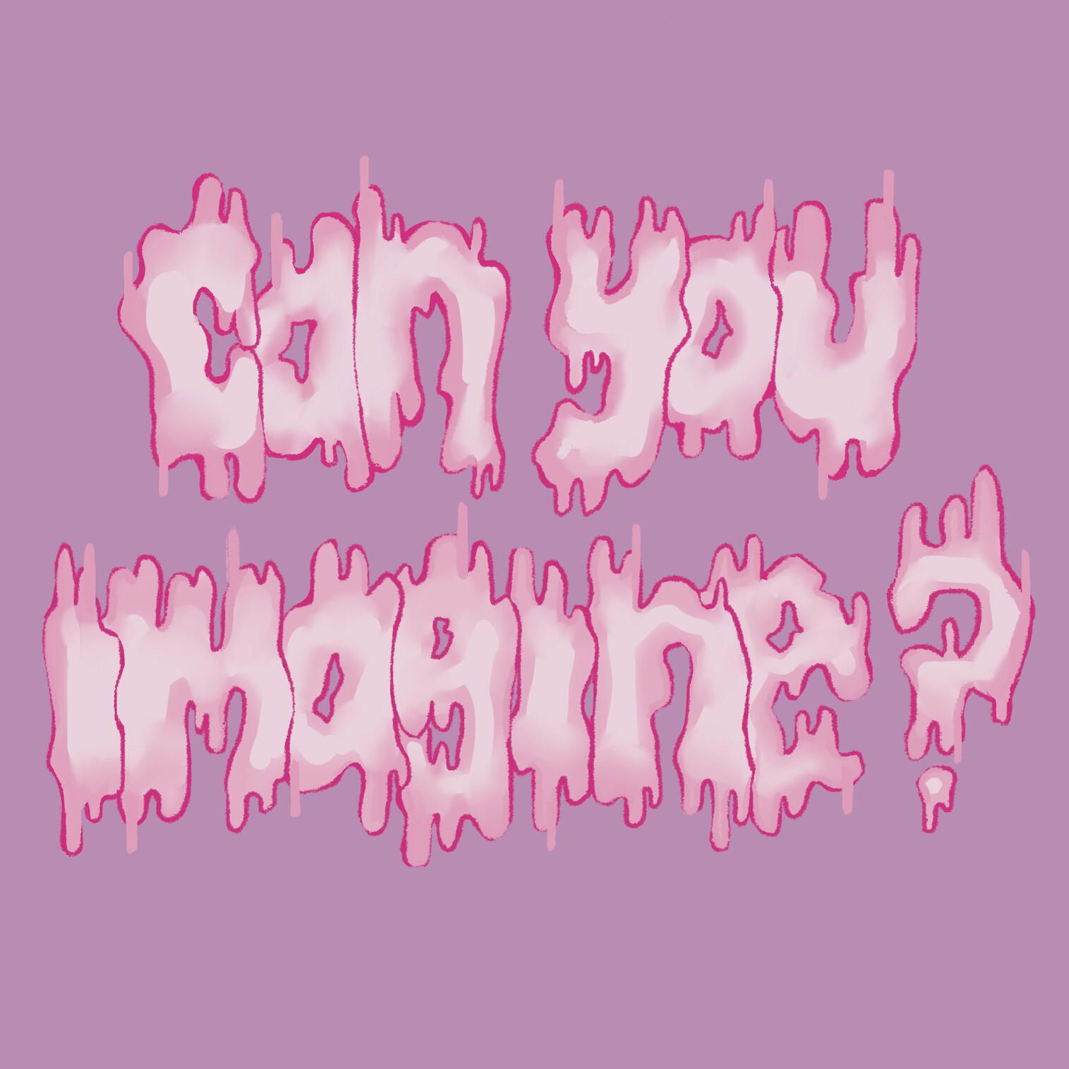
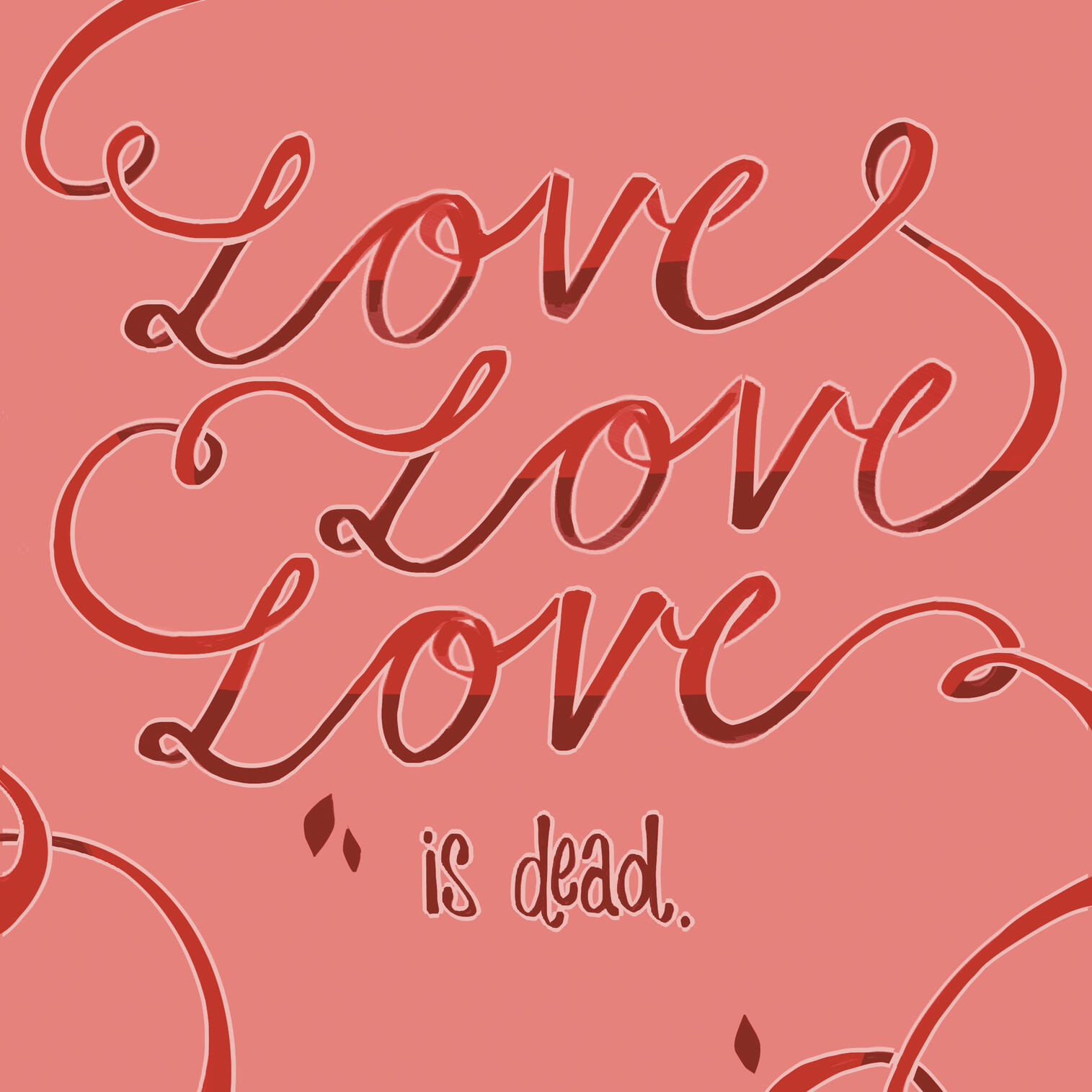
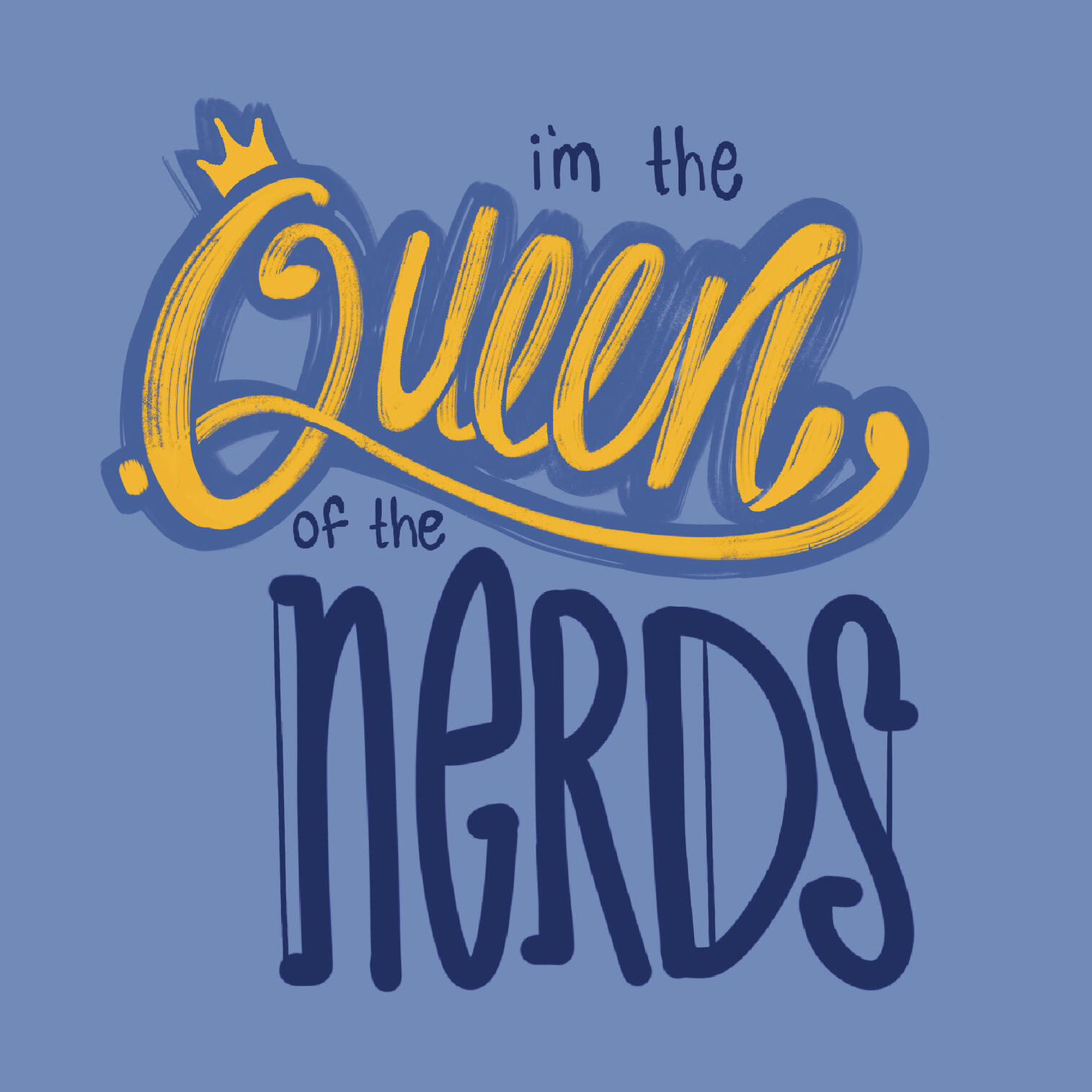
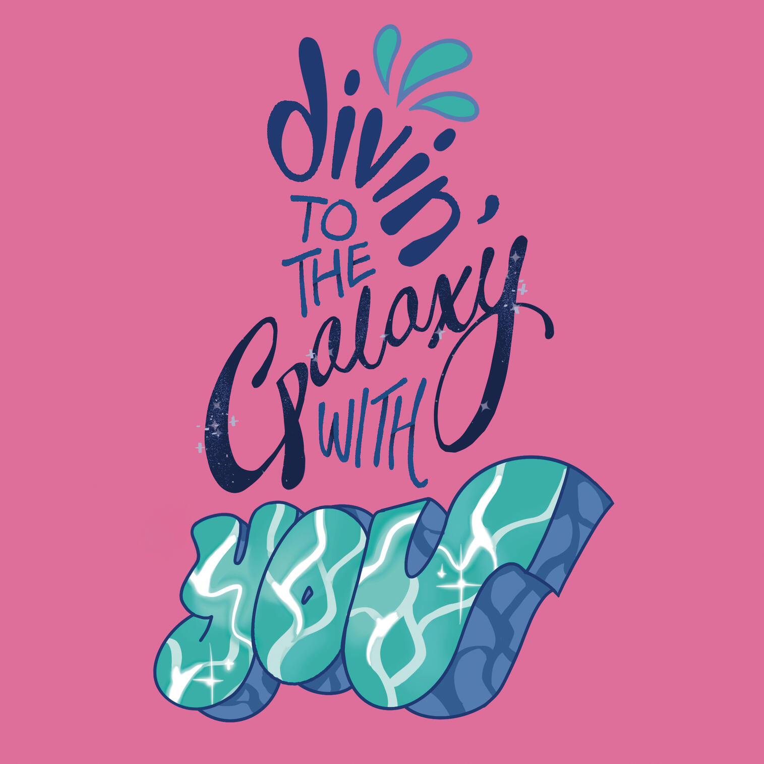
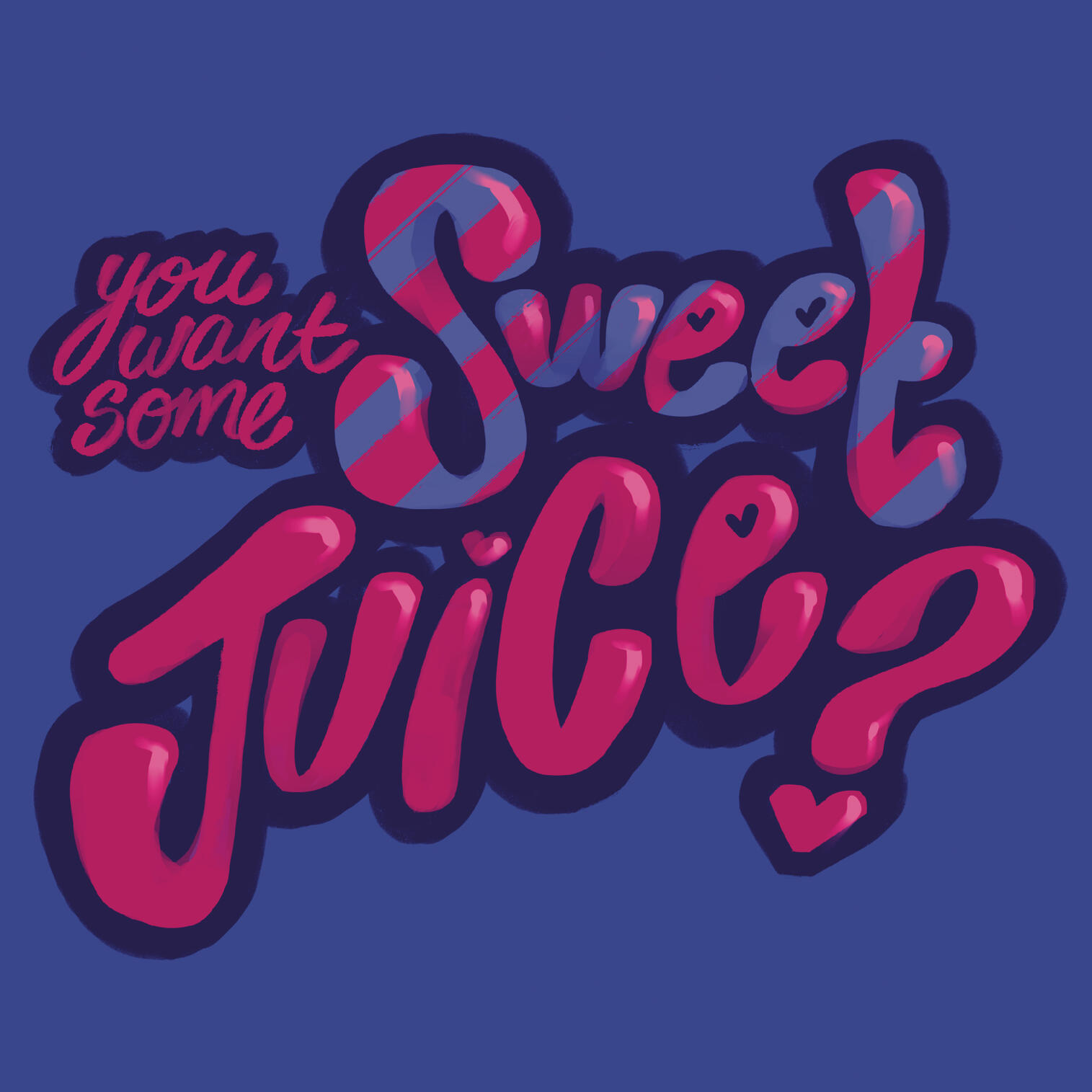
Purple Kiss Hand Lettered Lyrics
Lettering
Timeframe: 11 weeksRoles: Visual designer, Hand lettererTools: ProcreateDemographic: The intended audience of this project consisted of both fans of Purple Kiss and those that appreciate expressive hand-lettering.
Problem: In order to practice consistency and explore creative direction across multiple works, I challenged myself to complete a set of 9 lettering pieces that could come together as a cohesive unit.Solution: I created a hand-lettered series based on Purple Kiss’ lyrics, using consistent visual elements such as solid colored backgrounds, minimal texture, and line weight to create a collection that felt cohesive.

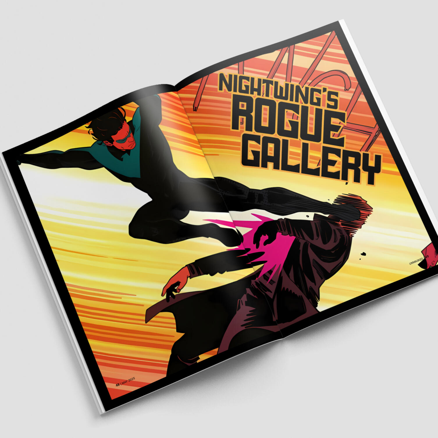
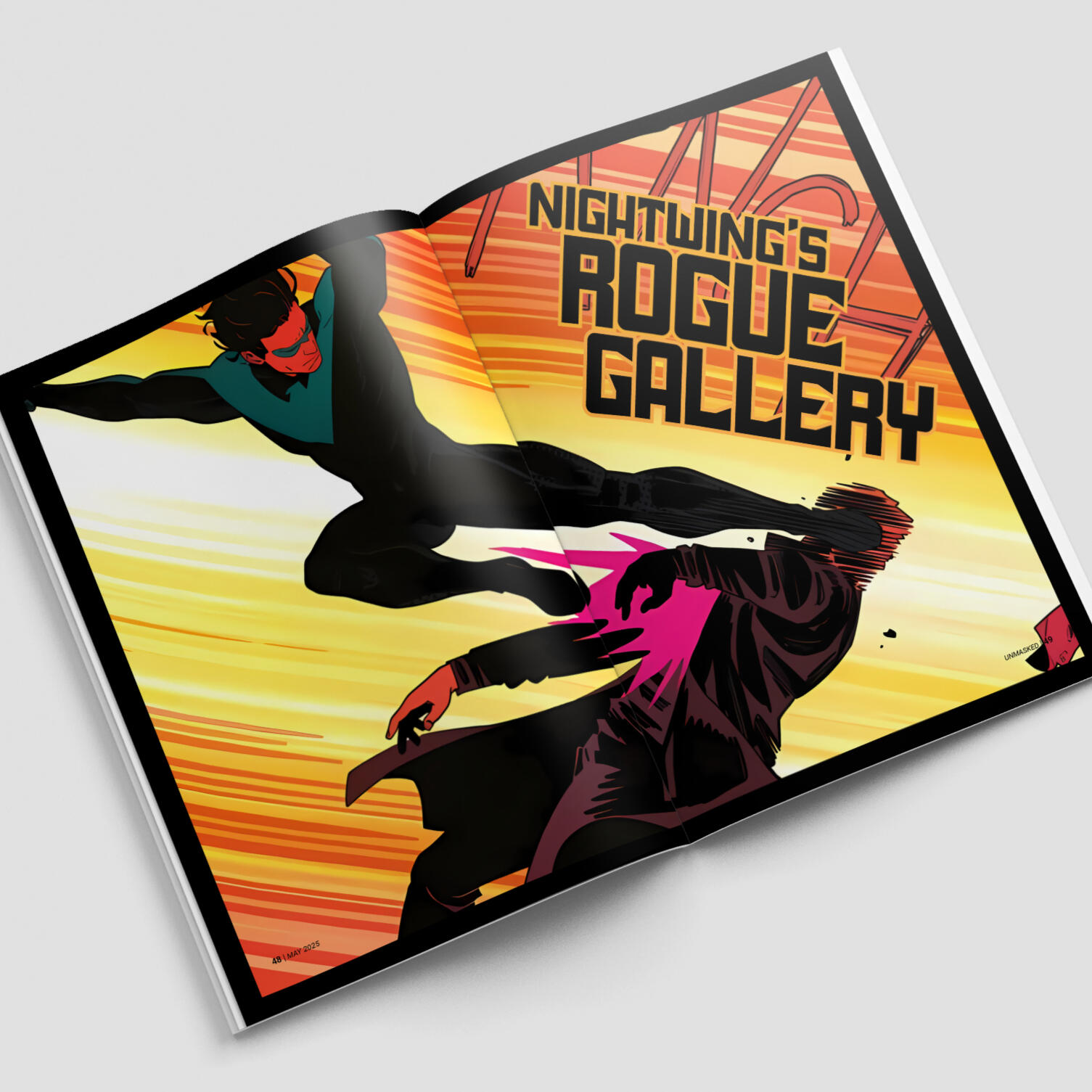
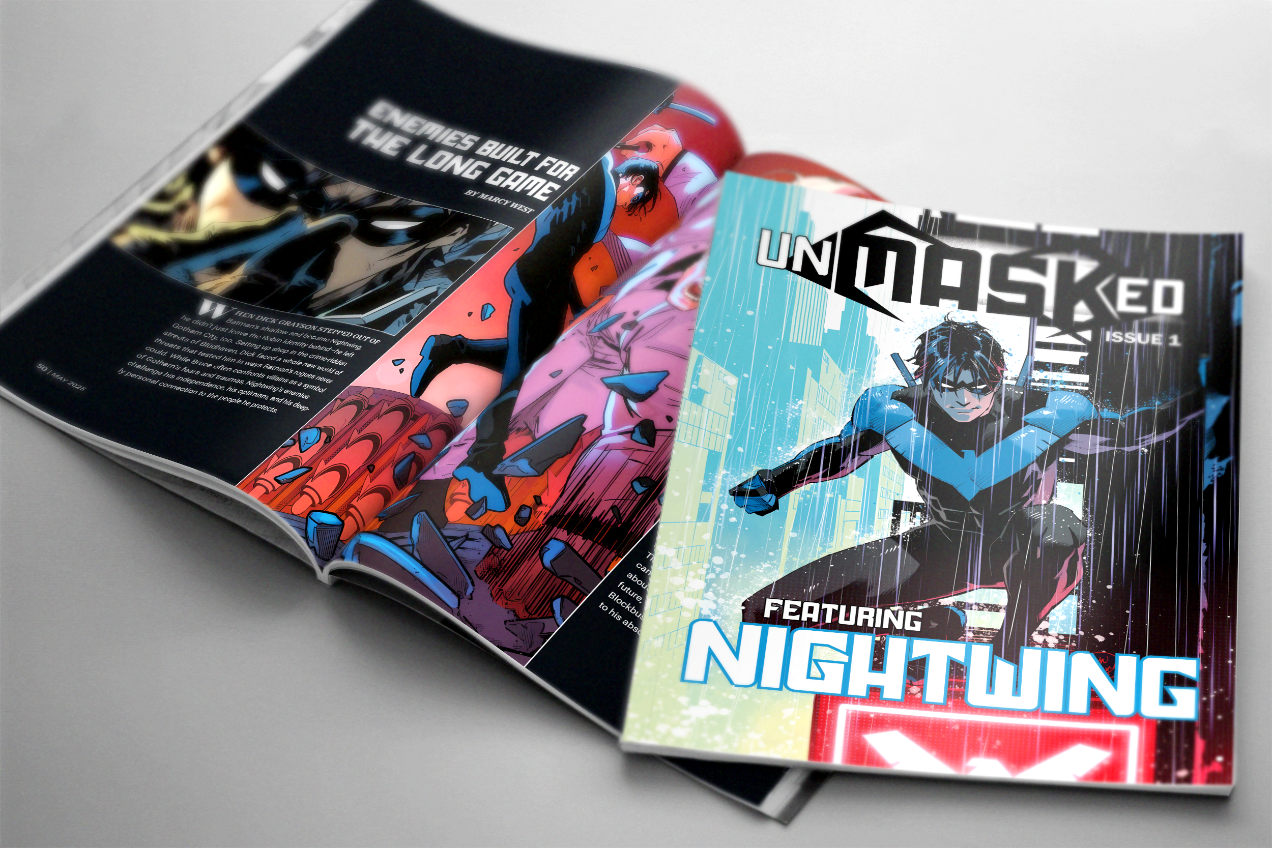
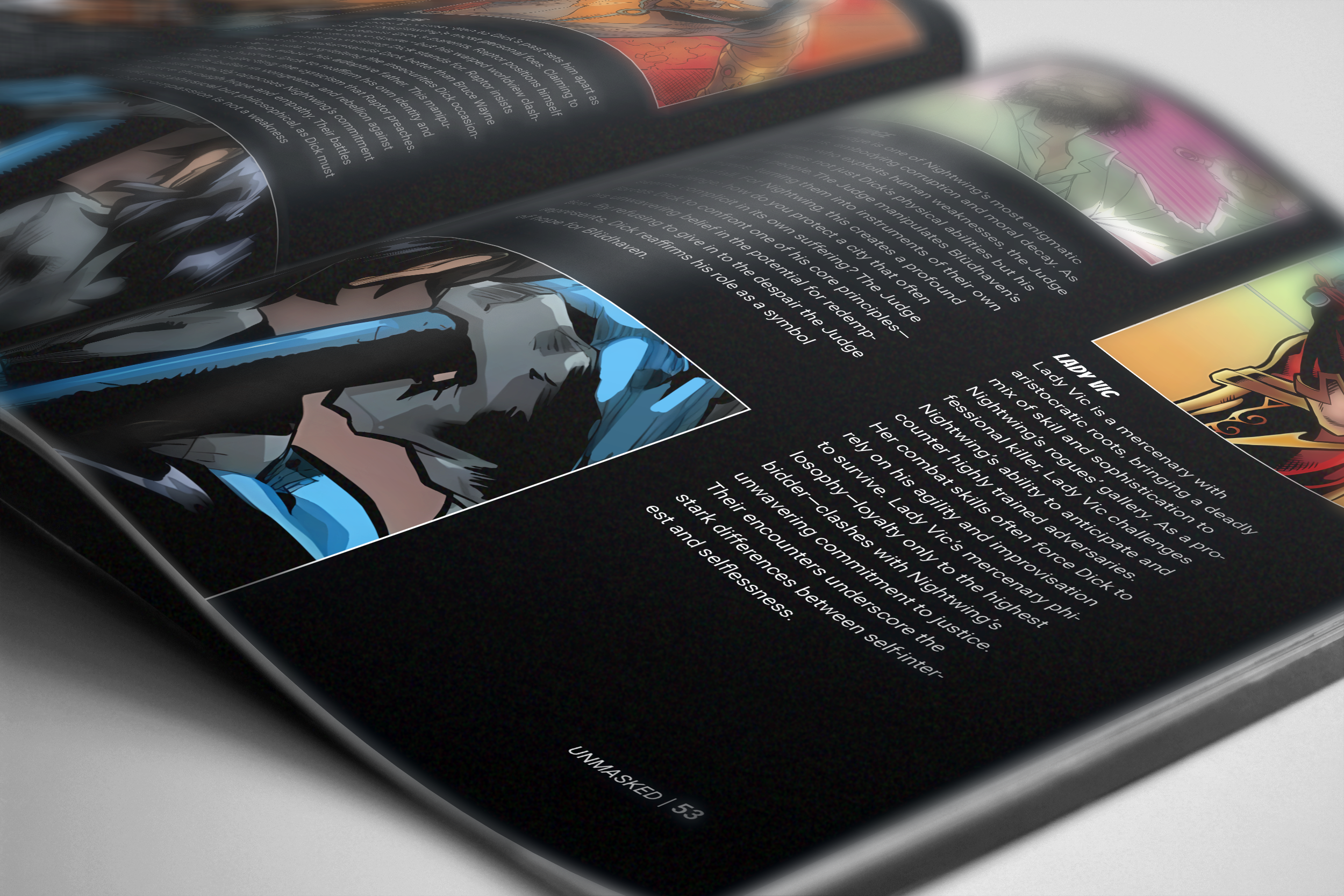
Unmasked Magazine
Editorial
Timeframe: 12 weeksRoles: Researcher, Print designerTools: After effects, Indesign, FigmaDemographic: Superheros have decades of content which might be intimidating to new fans. By choosing to focus on one character, it allows their story to be more accessible. The target audience in mind for this magazine includes casual fans, super fans, and collectors.
Problem: Character-focused publications are somewhat of a rarity within the comic book sphere, thus creating an opportunity to develop a magazine that explores a single character in depth.Solution: I developed a character-centric magazine using clean layouts, curated imagery, and character-inspired design choices to showcase their story and engage fans through easy to read content.
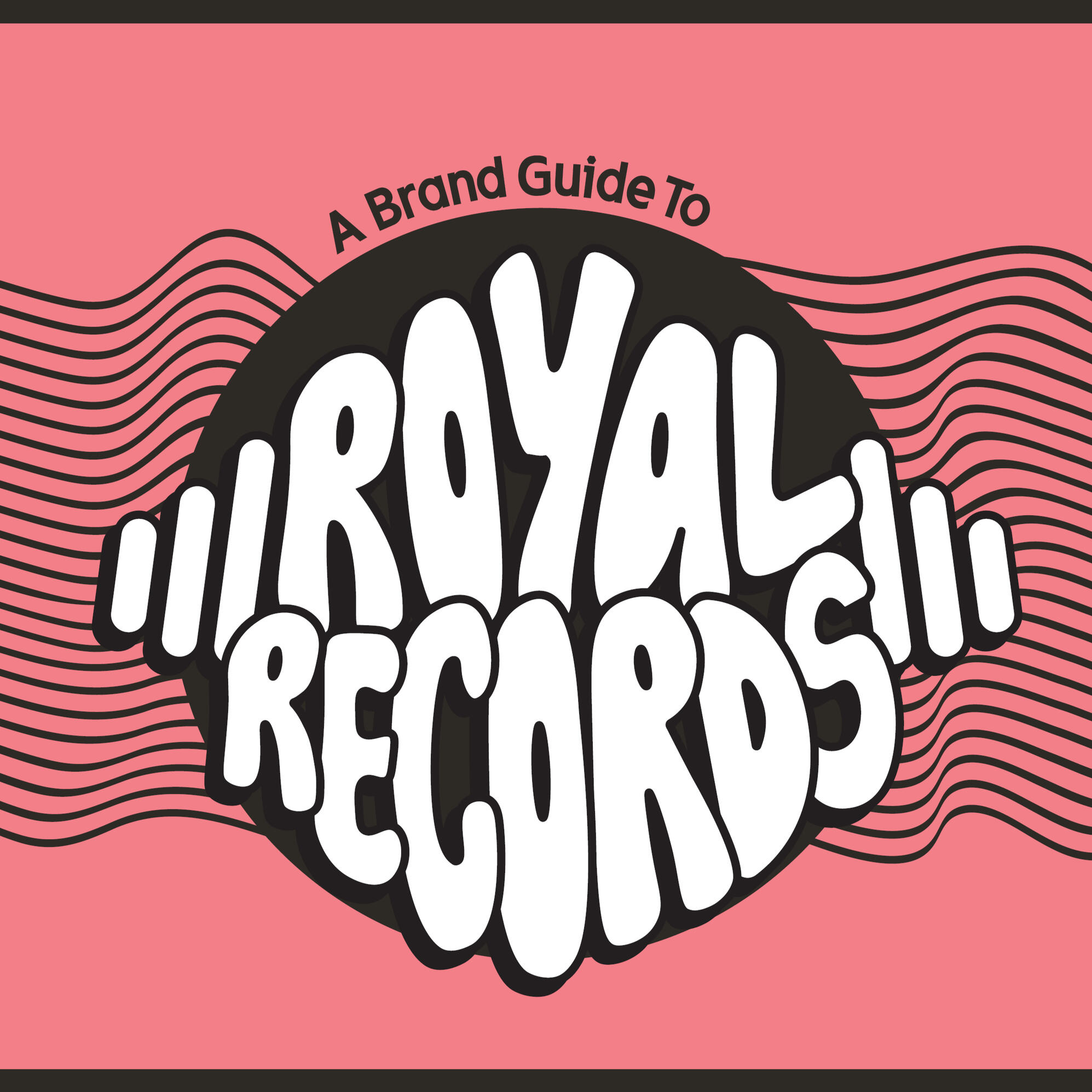
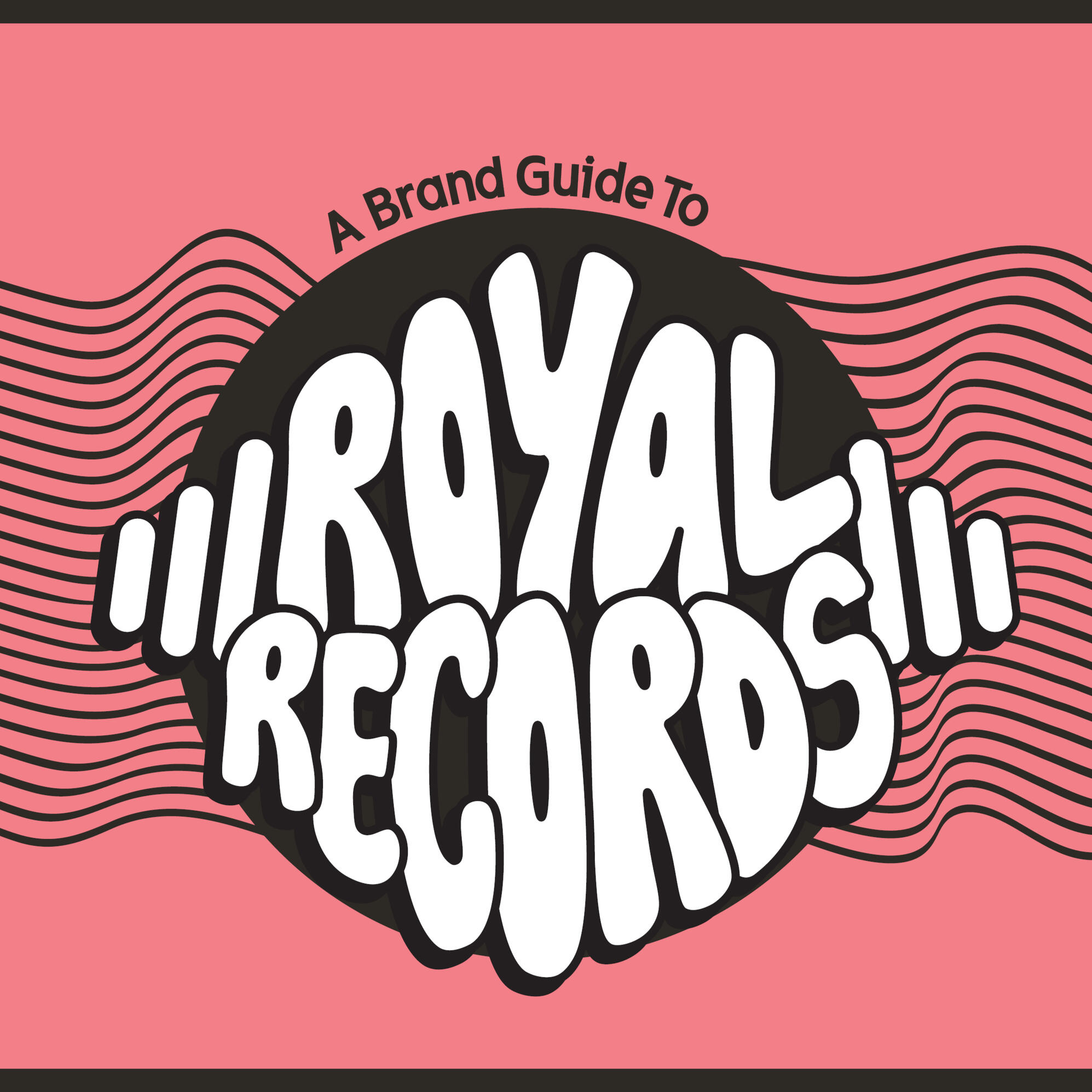
Royal RecoRds RebRand
Brand Identity
Timeframe: 12 weeksRoles: Researcher, Brand designer, CopywriterTools: Illustrator, Indesign, Photoshop, FigmaDemographic: Royal Records is a brick and mortar shop dedicated to providing a space for physical media, primarily records, as a way to keep vintage technology alive. They offer a diverse range of genres and include new releases alongside timeless classics. Their audience is a mix of longtime collectors and casual listeners which allow them to cater to a broad community of music lovers.
Problem: Beyond its website, the brand lacked an established visual identity that could be used across various media.Solution: Guided by the brand’s core values and personality, I developed a cohesive visual identity system that incorporates fluid shapes and lines to reference vintage patterns. Alongside defined graphics, a warmer color palette was chosen to enhance the brand’s approachability. These components are used within various collateral pieces to help strengthen their overall presence.
Selected spreads demonstrating brand system application and layout structure
A featured chapter outlining the brand’s narrative framework, key values, and voice guidelines
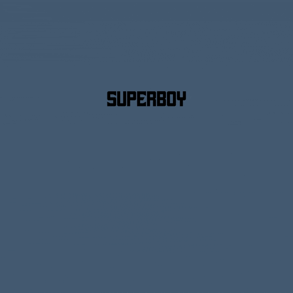
animated
typography
Motion
Timeframe: 7 weeksRoles: Motion designerTools: After effects, illustratorDemographic: Fans of all ages of the Young Justice TV series
Problem: I challenged myself to create a unified series of looping typographic animations to explore how typography could be used as a storytelling tool.Solution: By limiting my choices to one typeface and colors associated with each hero, I was able to create a visual story through typography and motion.